
Post #21
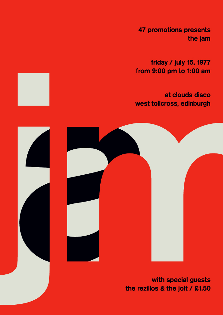
These are a couple examples of Swiss Style Typography, also known as the International Typographic Style. This is a style that I really really love- I like the simplicity and minimalism of it- each poster only really has one font and a minimal color scheme, and makes use of overlapping letterforms to add interest. The words are places on a strict and clear grid system- the columns of which are the most evident. Most of the Swiss Typography I have seen uses Helvetica- there are no fancy display fonts to distract the reader from the content of the poster- the visual interest comes from the placement of the larger letter forms, and the color of the background, which is often a bright, saturated color. I admire this style of Typography not only for it's visual appeal and ability to catch the eye, but also for its functionality, simplicity, and ledgability.


These are a couple examples of Swiss Style Typography, also known as the International Typographic Style. This is a style that I really really love- I like the simplicity and minimalism of it- each poster only really has one font and a minimal color scheme, and makes use of overlapping letterforms to add interest. The words are places on a strict and clear grid system- the columns of which are the most evident. Most of the Swiss Typography I have seen uses Helvetica- there are no fancy display fonts to distract the reader from the content of the poster- the visual interest comes from the placement of the larger letter forms, and the color of the background, which is often a bright, saturated color. I admire this style of Typography not only for it's visual appeal and ability to catch the eye, but also for its functionality, simplicity, and ledgability.
Comments
Post a Comment