
Post #16
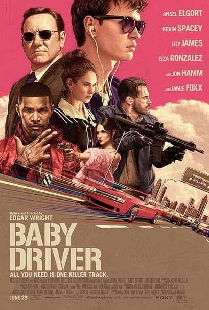
This is the movie poster for one of my favorite movies, Baby Driver, and the hierarchy on it works pretty well. The first thing you see after the image is the name of the movie, which is set in a large display font. This font resembles that of the numbers you would find on the spots in parking lots, which have negative space separating chunks of the letters. This choice works well because the main character is a getaway driver for a group of criminals. After the title, the viewer sees the name of the director, the movies catchphrase, and then the names of the actors, with their last names in a larger size than the first names. While putting the name of the movie in the top lefthand corner would have brought more attention to it, I think that this poster still works, and puts focus soon the image first rather than the text to get the attention of the viewer. The image brings the viewer in, and then they read the text according to the hierarchy of it.
This is the movie poster for one of my favorite movies, Baby Driver, and the hierarchy on it works pretty well. The first thing you see after the image is the name of the movie, which is set in a large display font. This font resembles that of the numbers you would find on the spots in parking lots, which have negative space separating chunks of the letters. This choice works well because the main character is a getaway driver for a group of criminals. After the title, the viewer sees the name of the director, the movies catchphrase, and then the names of the actors, with their last names in a larger size than the first names. While putting the name of the movie in the top lefthand corner would have brought more attention to it, I think that this poster still works, and puts focus soon the image first rather than the text to get the attention of the viewer. The image brings the viewer in, and then they read the text according to the hierarchy of it.
Comments
Post a Comment